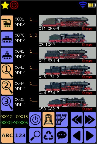
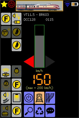
Something that bothered me for a long time already, was the color-scheme and overal presentation of the icons.
Those TFT-screen do have a tendency to “discolor” the whole screen, when you look at them under an angle.
With my new color scheme, I tried to find a solution for this …
Not only the color scheme is changed, but the overal representation looks more crisp and better.
(Not only by a better color-choise, but also due to a better anti-aliasing algorithme)
I’m pretty happy with the result, and I think I will stick with these icons as a final result …
One more thing that I can take of my (still long) todo-list 🙂